Columns and grid
Place blocks side by side on the page using a grid.
By default, blocks stack down the page in a single column. When you want two or three things sitting next to each other, you use a grid.
A grid is a row split into cells. Each cell holds its own blocks: a paragraph, an image, a question, anything. Cells can hold more than one block.
Make a grid
There are two ways.
Drag a block next to another one. Pick up any block by its drag handle and drop it onto the left or right edge of another block. The two blocks land in a row, side by side, in a new two-column grid.
Insert a grid from the slash menu. Type /grid and pick the grid
block. A two-column grid appears with an empty cell on each side. The
cursor lands in the left cell.
Type into a cell the same way you type into the rest of the page. Add a
block by typing / inside a cell.
A grid can have up to six columns.
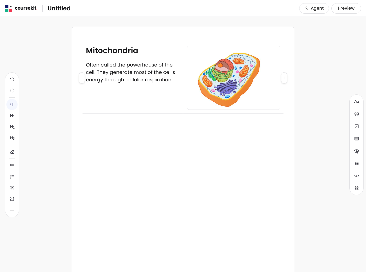
Grid controls
A grid has two sets of controls.
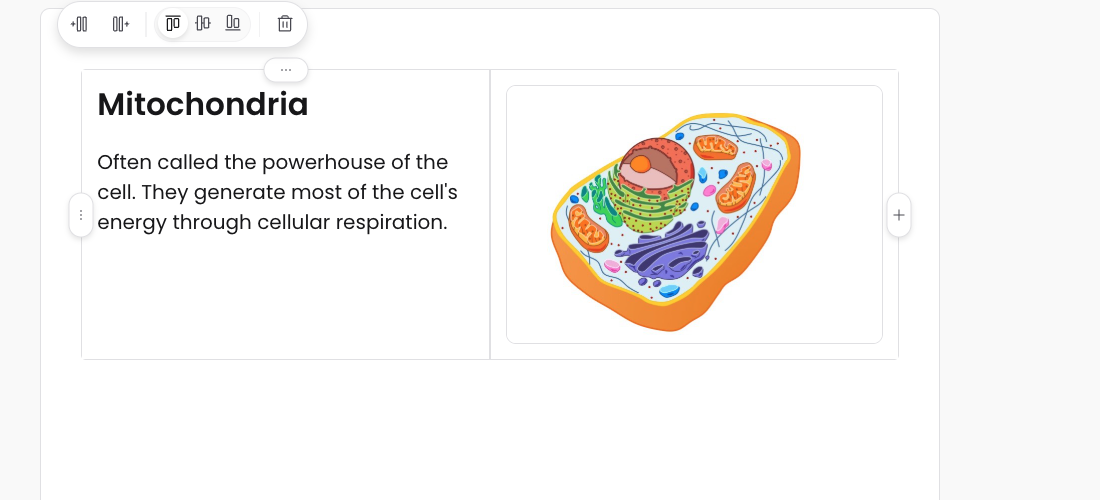
Cell buttons appear at the top of a cell when you hover over it. Click a cell button to open its menu: add a column to the left of this cell, add one to the right, or remove this cell.
The grid button sits on the left of the grid. Click it to open the grid-level menu, which acts on the grid as a whole.
Add a column to the right of the right-most cell to grow the grid. Remove a cell to shrink it.
Resize columns
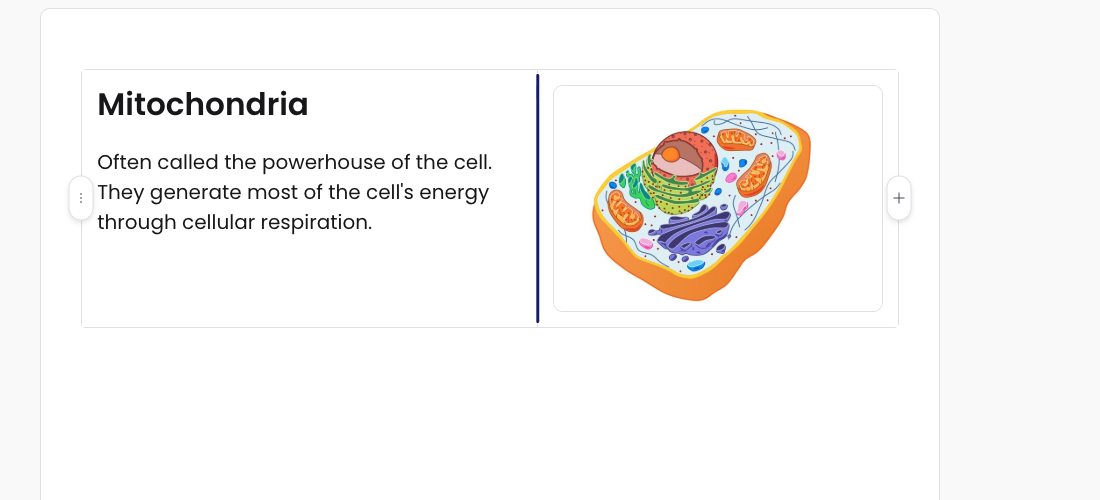
Between every pair of columns is a thin handle. Drag it left or right to make the columns wider or narrower. The other columns adjust to fit.
There’s a minimum column width below which the handle won’t go any further.
Vertical alignment
Each cell can align its contents to the top, middle, or bottom of the row. Use this when one cell is taller than the others (an image next to a paragraph, for example).
The vertical alignment control lives in the cell menu — click the cell button at the top of the cell to open it.
What’s next
- Layout containers are the other way to organise content. Use them when you want tabs, an accordion, or a step-by-step process instead of side-by-side cells.